Walmart Health
Revitalizing trust in a neighborhood healthcare brand.
A design system (signage, wayfinding and photography direction) built for Walmart Health’s Chicago centers, then extended into a 360° neighborhood launch campaign for the Auburn Gresham location.
Overview
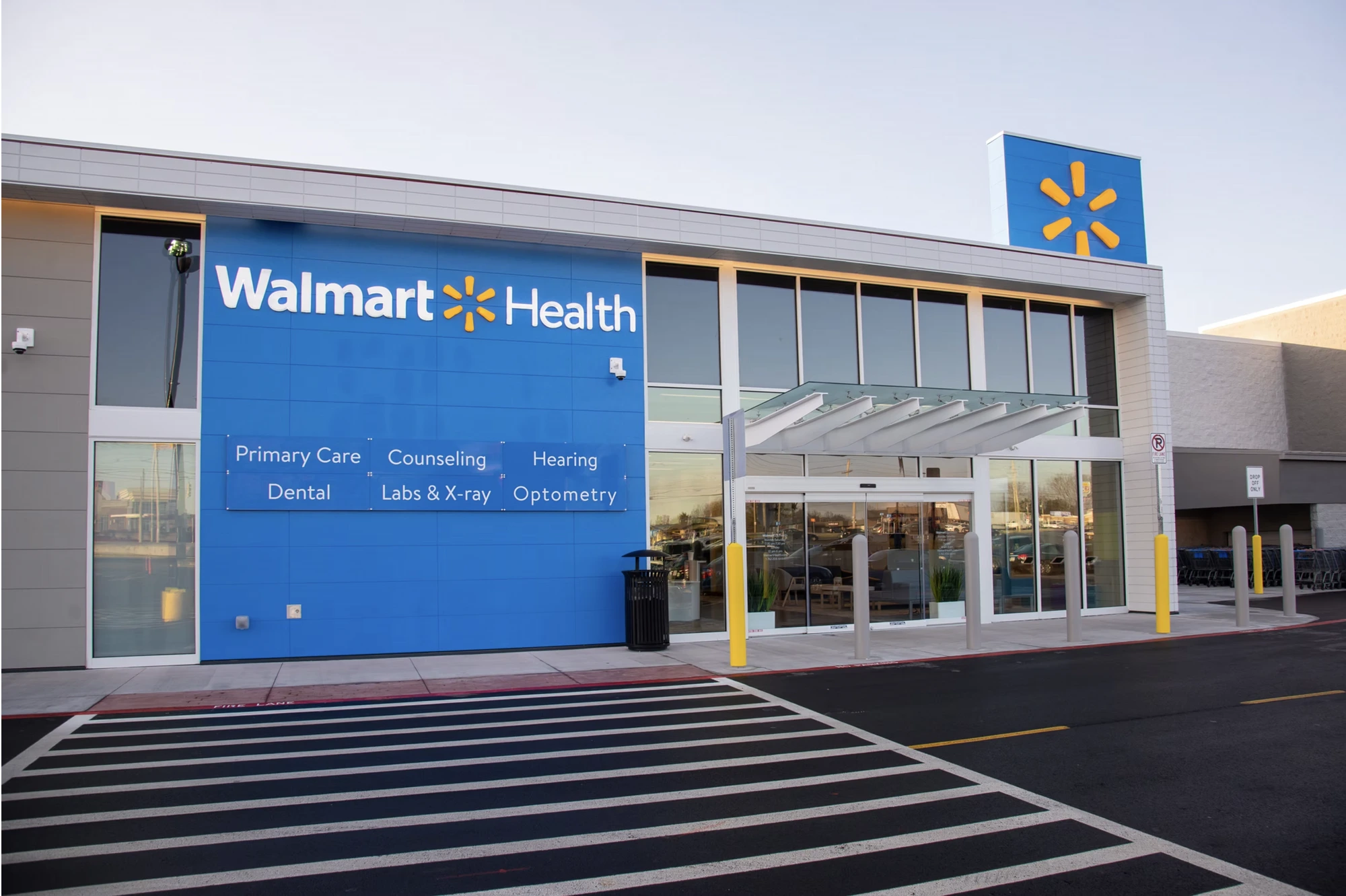
Walmart Health was opening neighborhood health centers across Chicago (including Auburn Gresham) offering primary care, dental, counseling, labs & X-ray, hearing and optometry at accessible prices, with or without insurance. Six different services needed to read clearly on one storefront wall, and feel just as coherent everywhere else the brand showed up.
Challenge
Build a system (not just a campaign) that could carry six services on a single storefront sign, feel warm and trustworthy rather than clinical in every photograph, and still flex consistently across billboards, bus shelters, print and social for a specific neighborhood launch.
What I did
- 01Design system logic
- 02Signage & wayfinding
- 03Photography direction
- 04Campaign concept & art direction
- 05OOH & print collateral
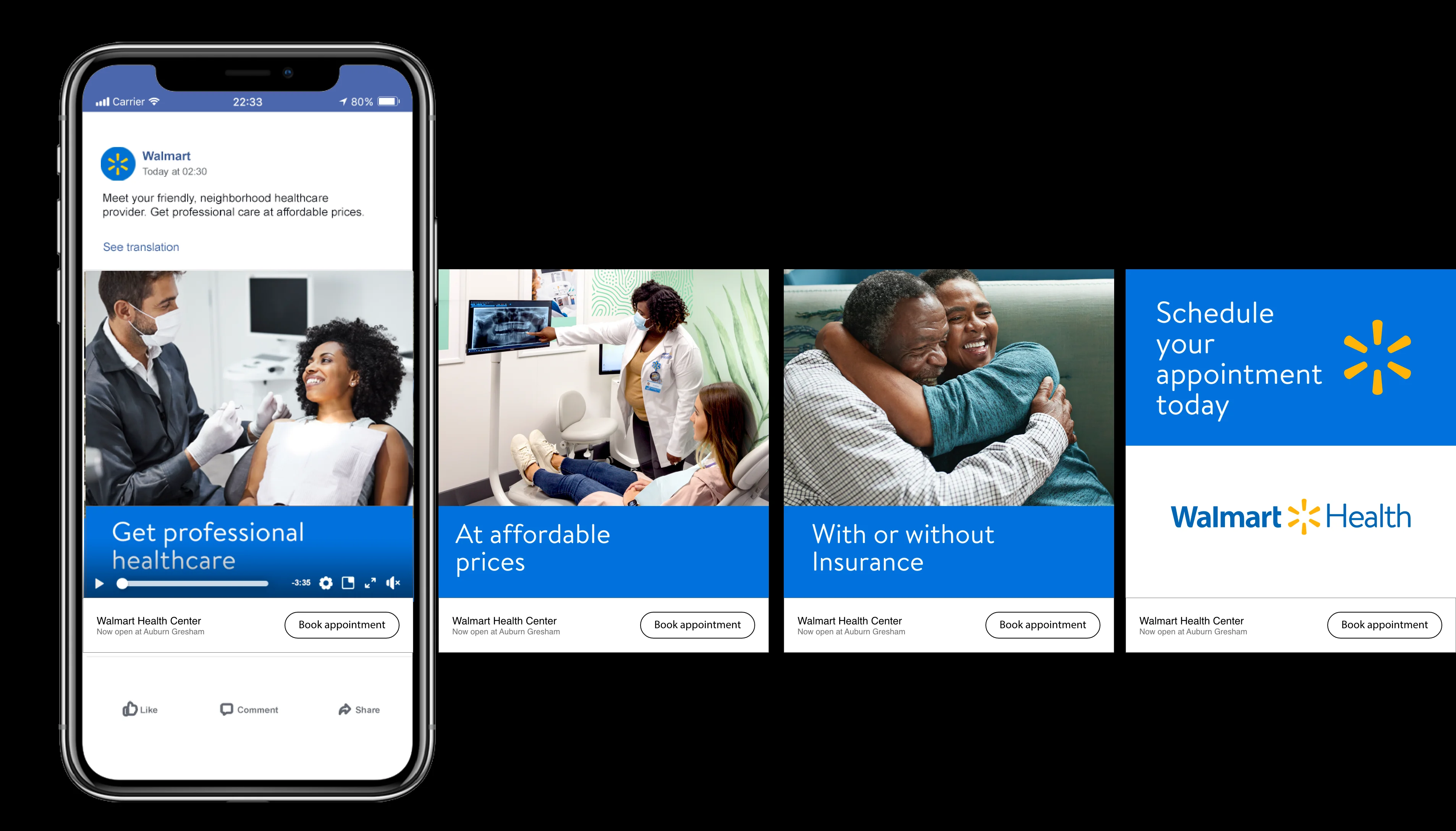
- 06Social & digital ads
Approach
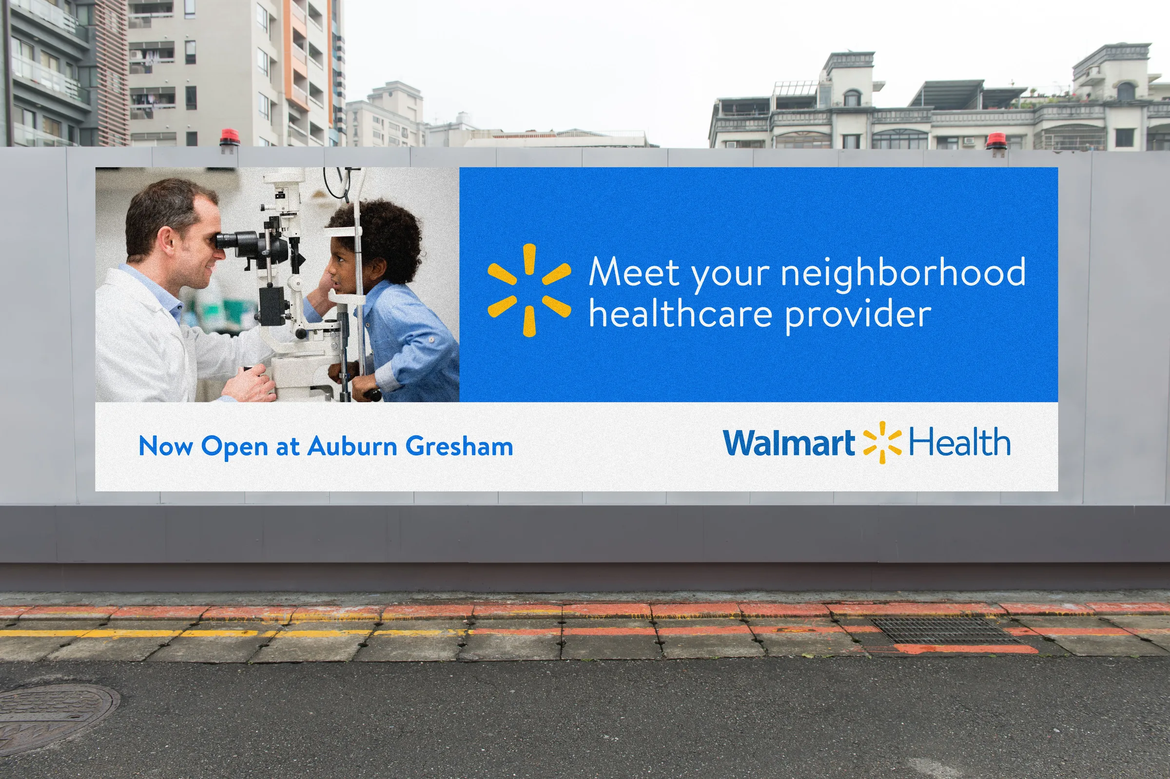
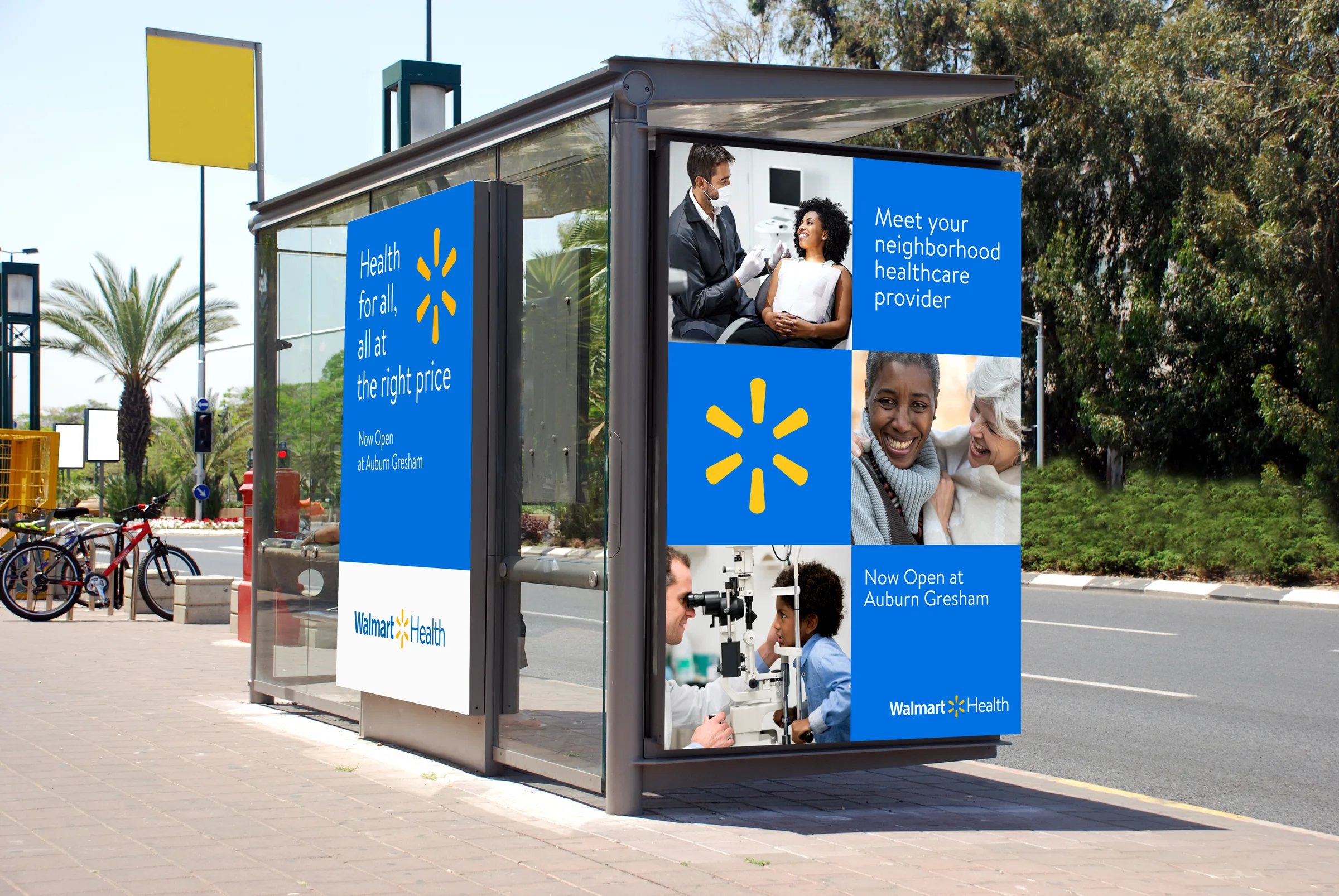
Two decisions carried the whole system. First, wayfinding: one consistent panel treatment for every service (Primary Care, Dental, Counseling, Labs & X-ray, Hearing, Optometry) so a six-service storefront still reads at a glance from a moving car. Second, photography: warm, close, human portraits instead of clinical stock imagery, so trust is felt before a word is read. The campaign layer then leads with the neighborhood, not the brand: ‘now open at Auburn Gresham’ sits as prominently as the Walmart Health name on every touchpoint, so the message reads as an invitation from a neighbor.
The system
- Wayfinding & Signage
- Photography Direction
- OOH System
- Print Collateral
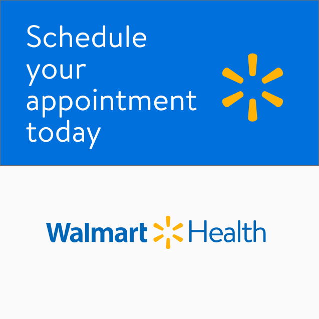
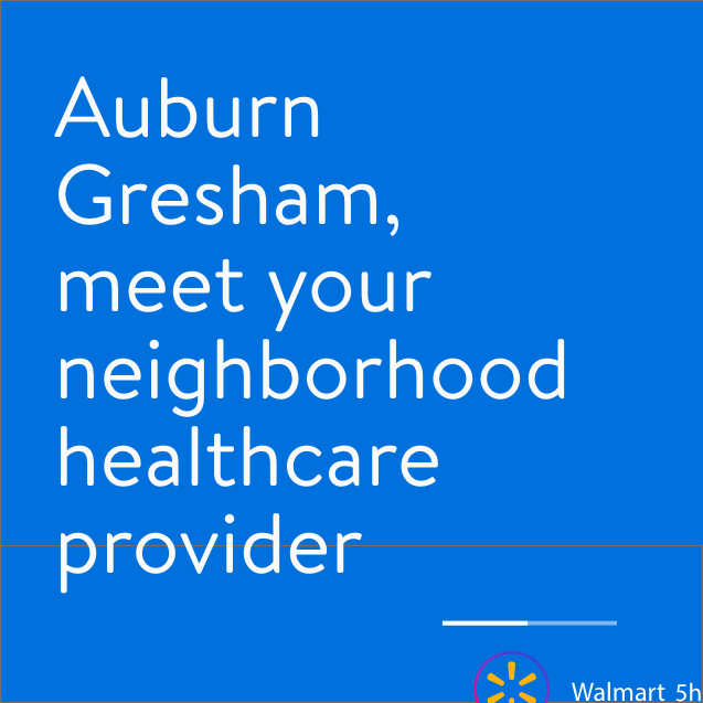
- Paid Social Templates
Grassroots
We never forget our humble beginnings; we’re relatable, down-to-earth, and part of the community.
Auburn Gresham led every touchpoint: as prominent as the Walmart Health name itself.
Agile
Agility is our x-factor. We are constantly improving, endlessly testing, always adapting.
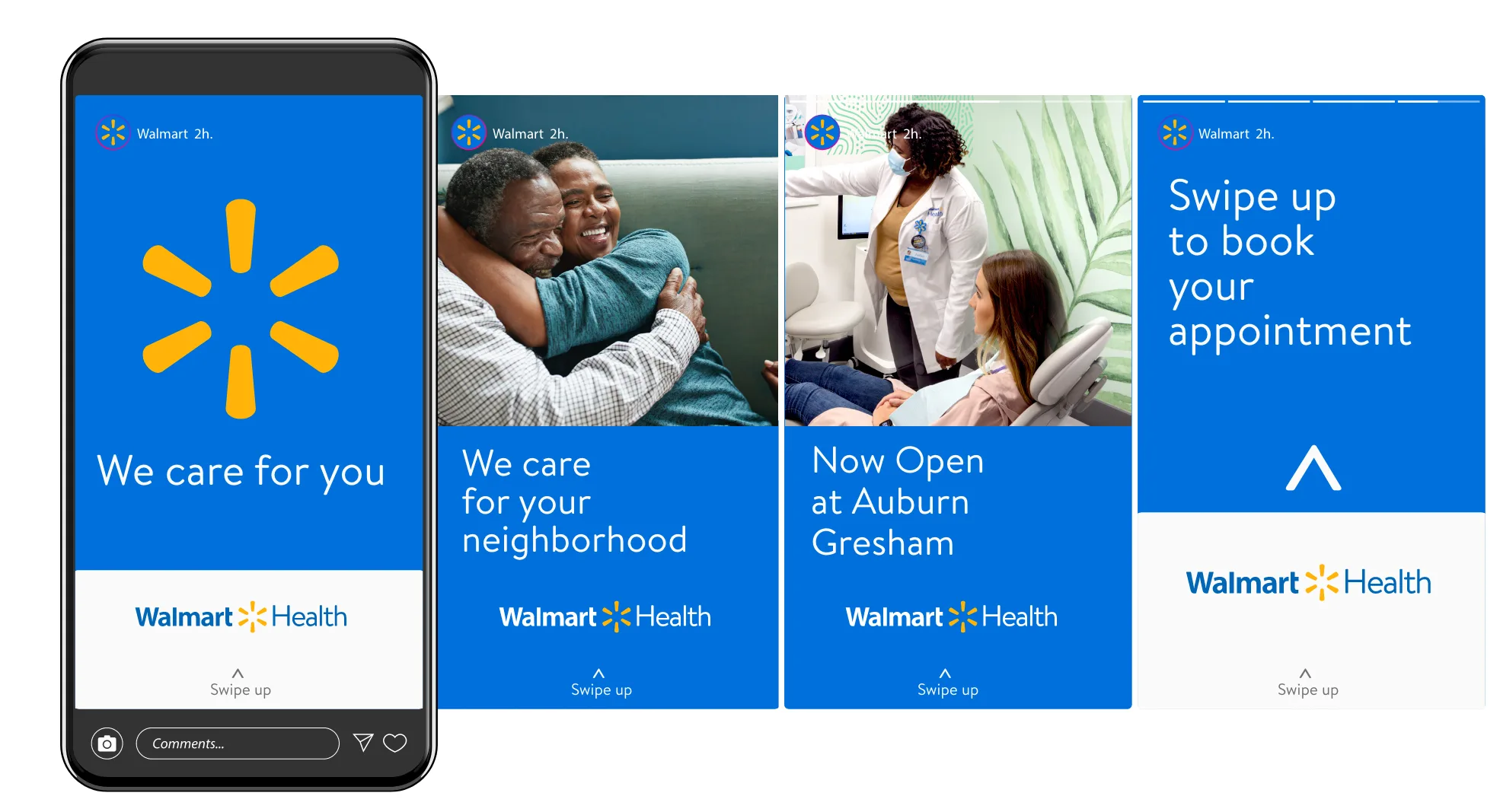
One wayfinding system flexed from a storefront wall to a bus shelter to a Stories frame without breaking.
Pioneering
Since the beginning, we’ve blazed a path and never settled, because that’s what it takes to make life better and easier.
Bold signage and the spark mark made a six-service health center legible from a moving car.
Design development

“We never forget our humble beginnings; we’re relatable, down-to-earth, and part of the community.”
“Agility is our x-factor. We are constantly improving, endlessly testing, always adapting.”
“Since the beginning, we’ve blazed a path and never settled, because that’s what it takes to make life better and easier.”
Save money. Live better.
Execution




Impact
- 01One message (“now open in your neighborhood”) held together across billboard, bus shelter, print, stories, feed and paid social without feeling like six different campaigns.
In categories built on complexity, clarity is the most generous thing design can offer, and the most local thing a launch campaign can say is simply: we’re here now.