Makers Beach
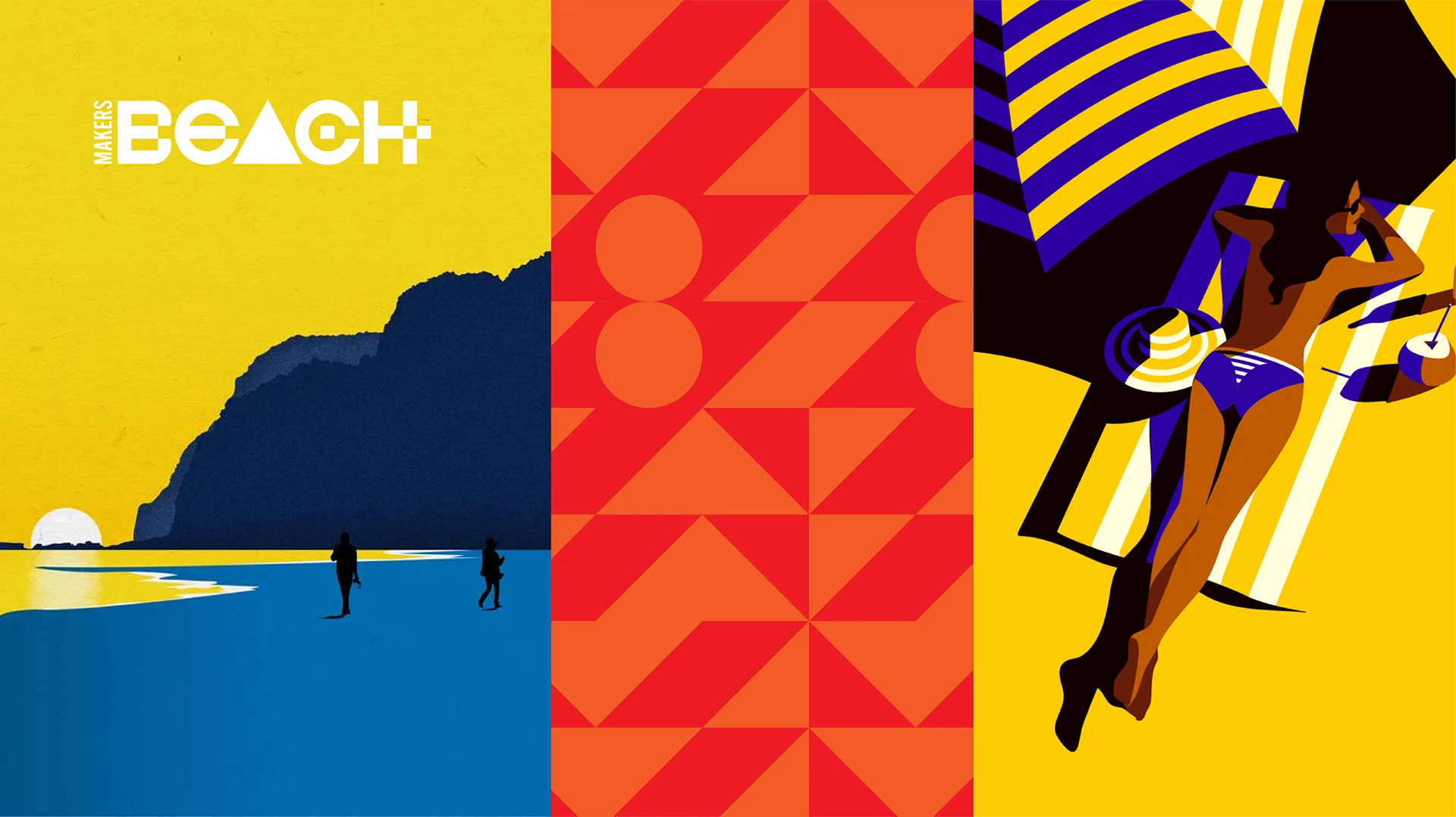
A wordmark built from three shapes and a sunset.
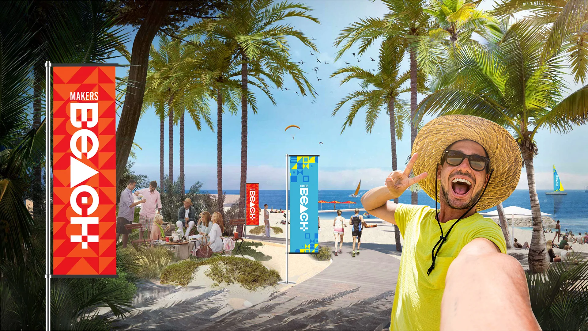
A lifestyle identity for Makers Beach (the beach-club brand within Makers District, Abu Dhabi’s waterfront community), carried from a shape-built logotype into OOH, merch and a printed community tabloid.
Overview
Makers District is a waterfront community development in Abu Dhabi. Makers Beach is its beach-club (the place residents and visitors go to switch off) and it needed its own lifestyle identity, distinct from but clearly part of the wider Makers family.
Challenge
Build a logotype and pattern system loose enough to feel like a beach club, not a corporate sub-brand, then carry that same energy across launch OOH, on-site merch and a printed community read, without a single stock beach cliché.
What I did
- 01Logotype construction
- 02Colour & pattern system
- 03Illustration direction
- 04Campaign concept & taglines
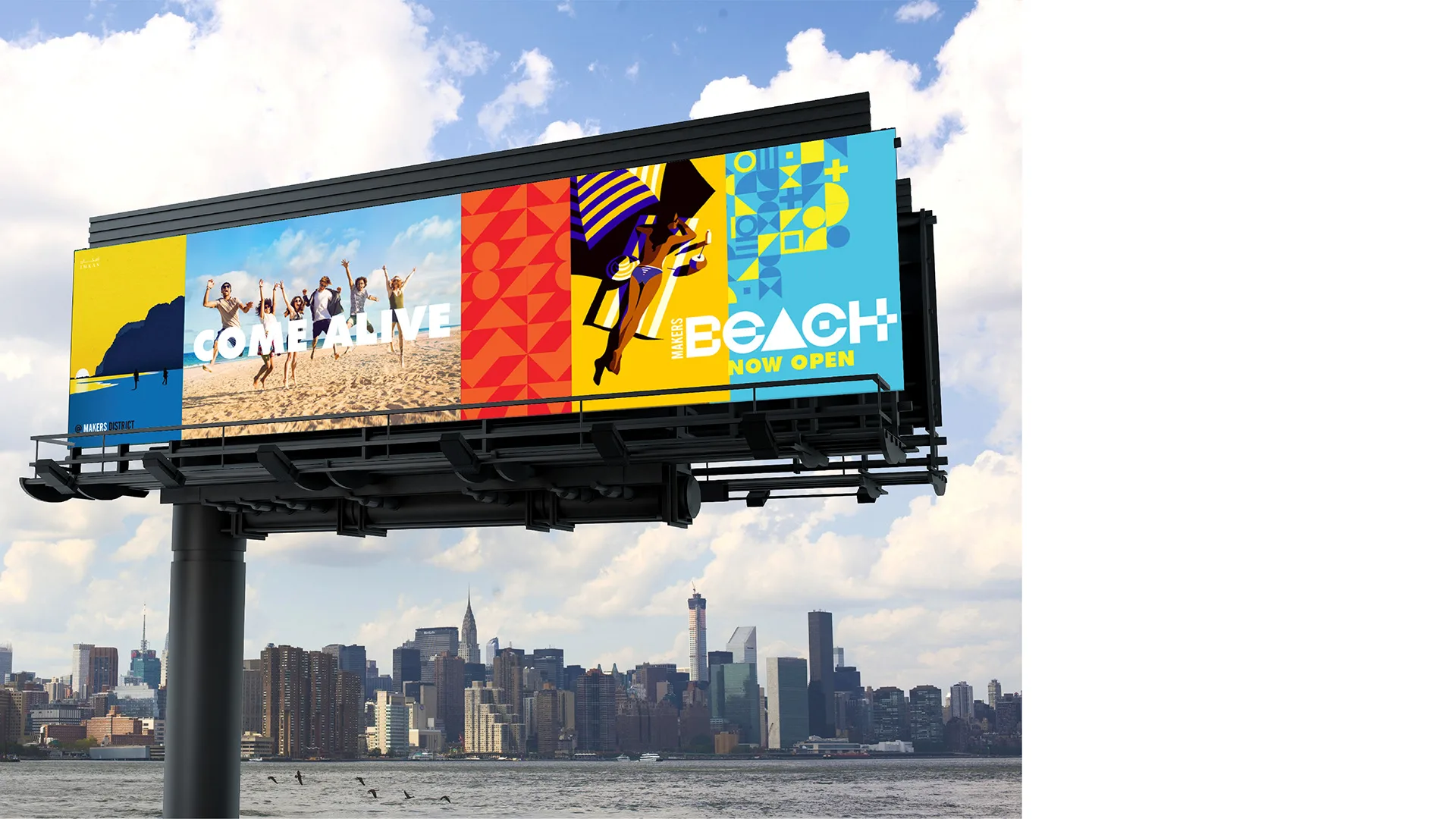
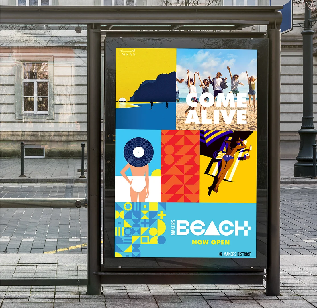
- 05OOH & environmental design
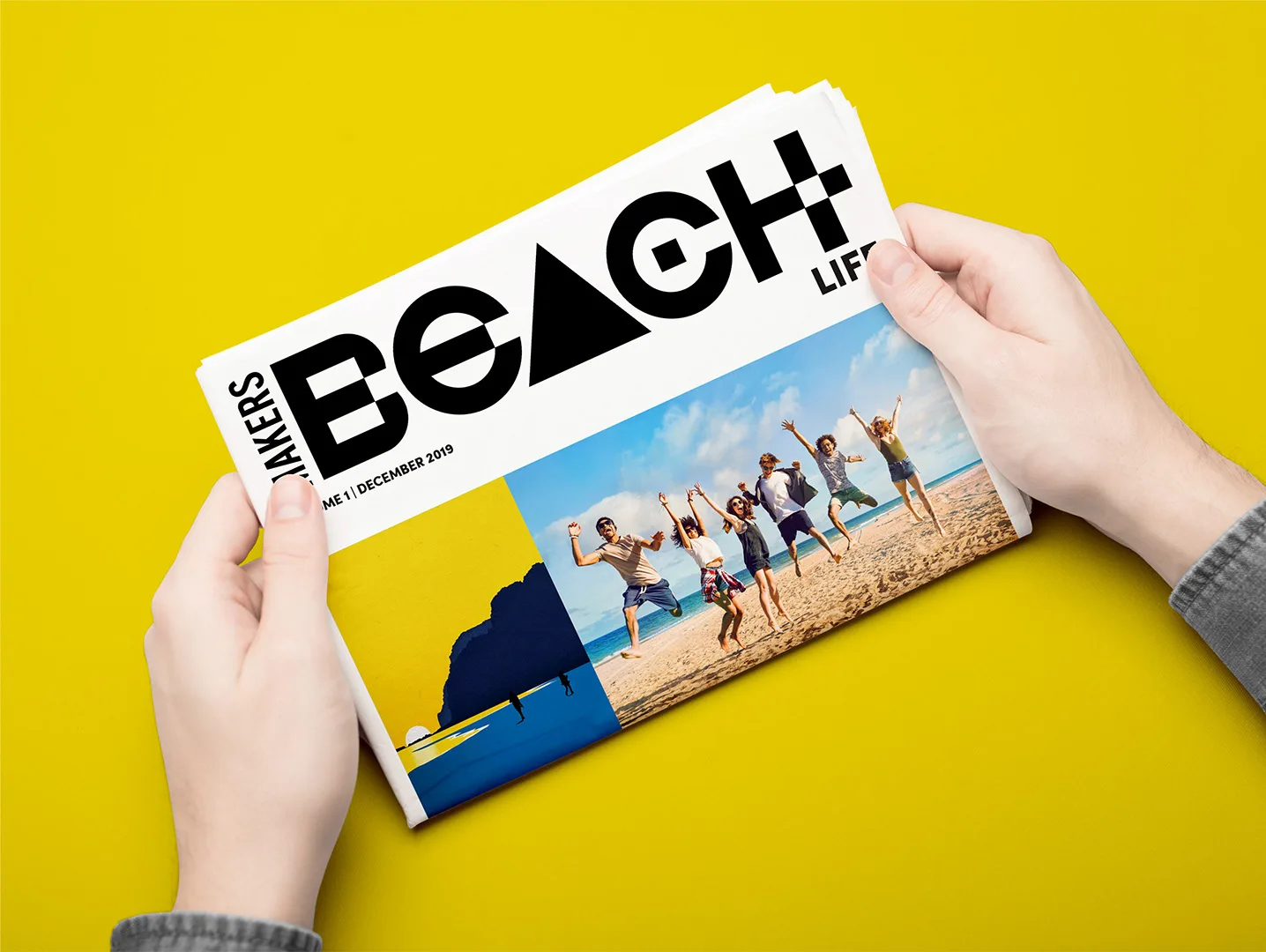
- 06Editorial design (Beach Life tabloid)
Approach
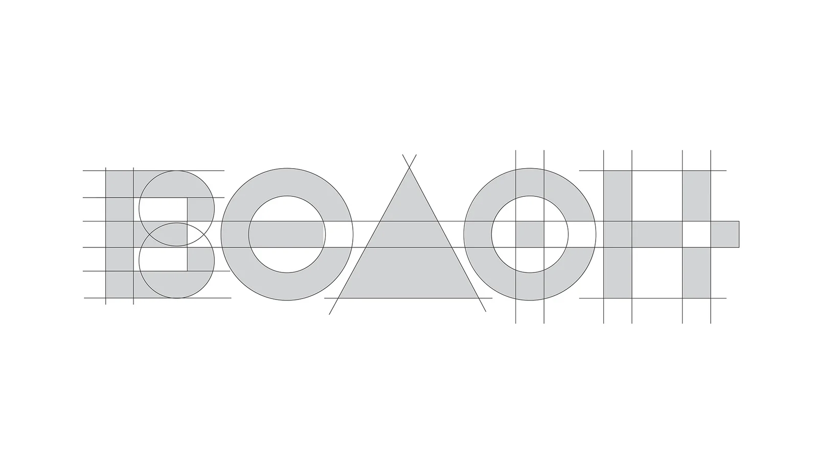
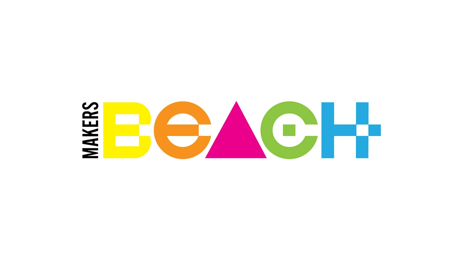
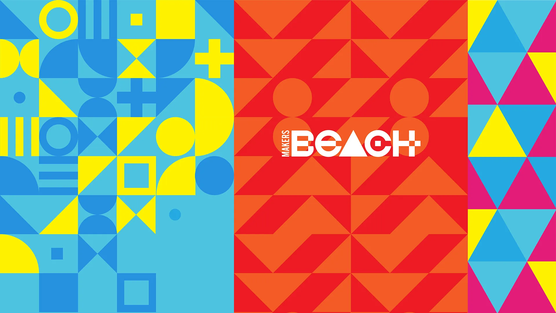
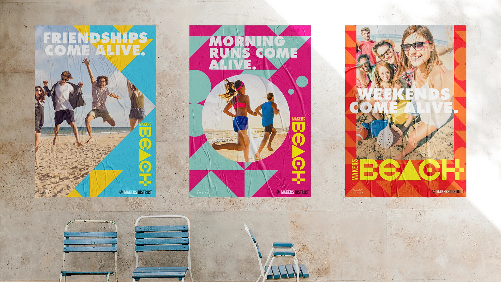
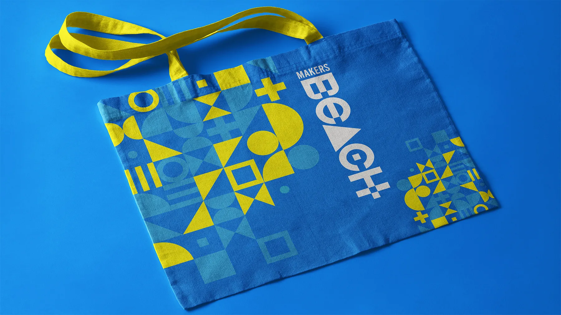
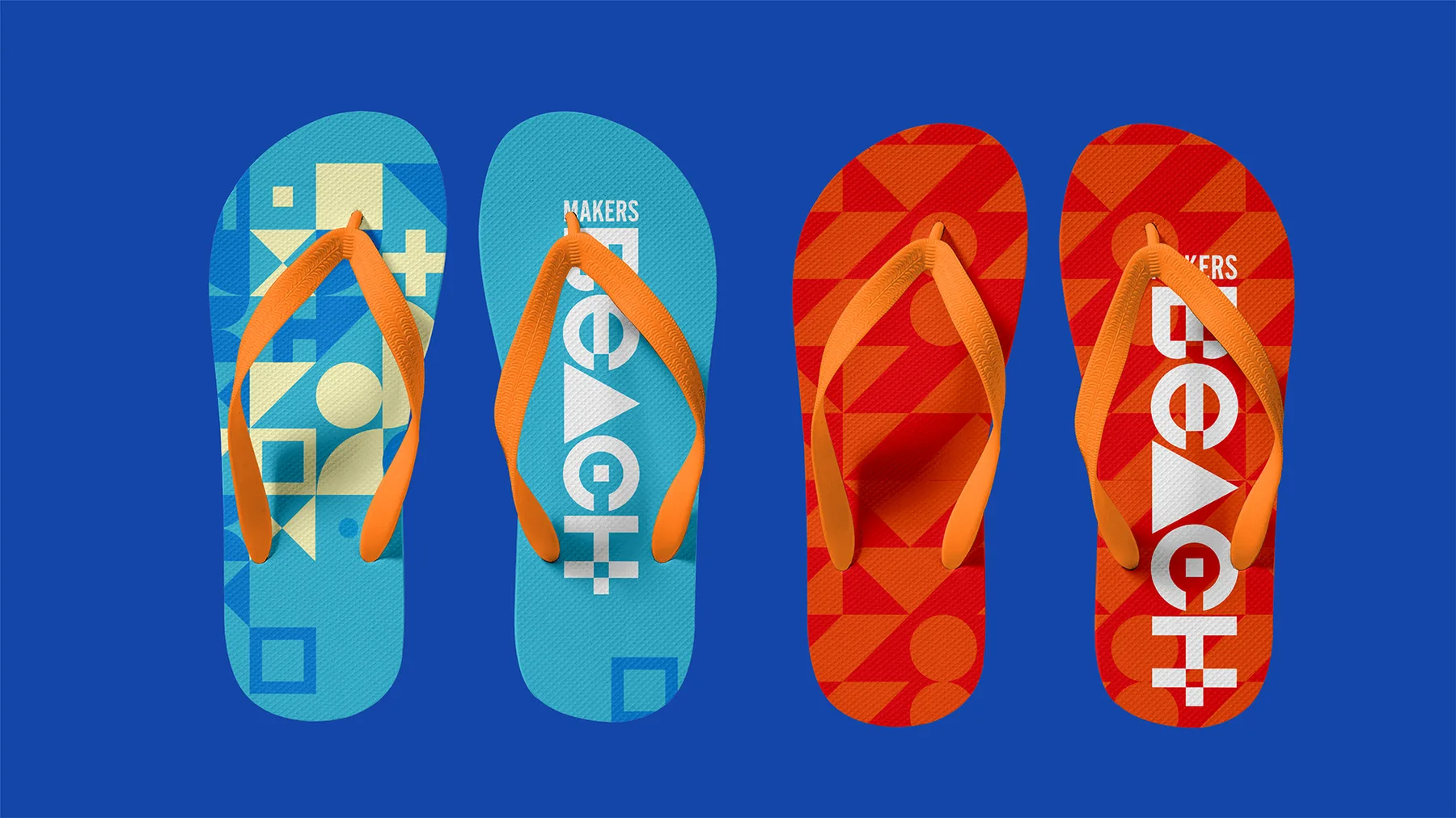
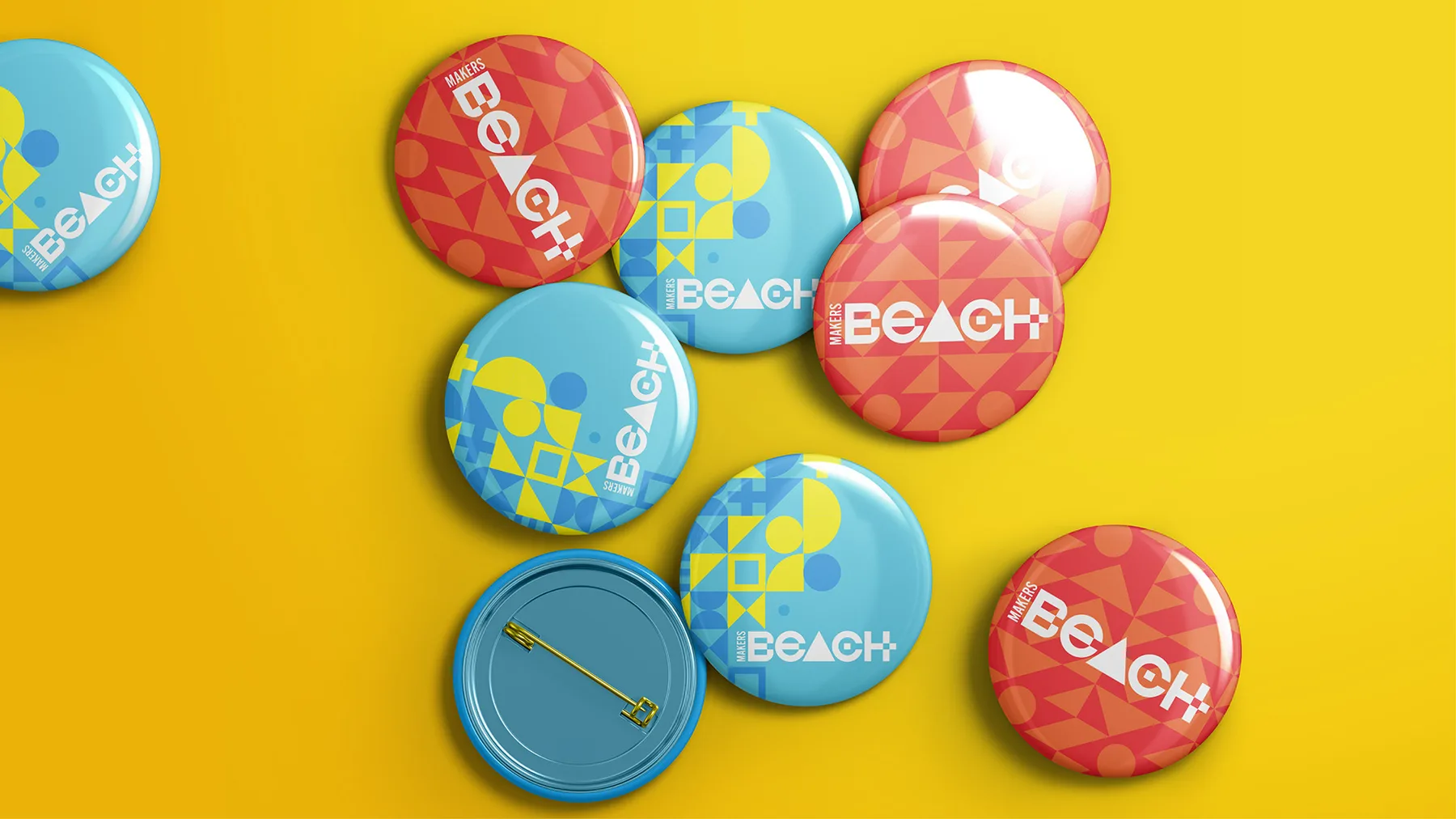
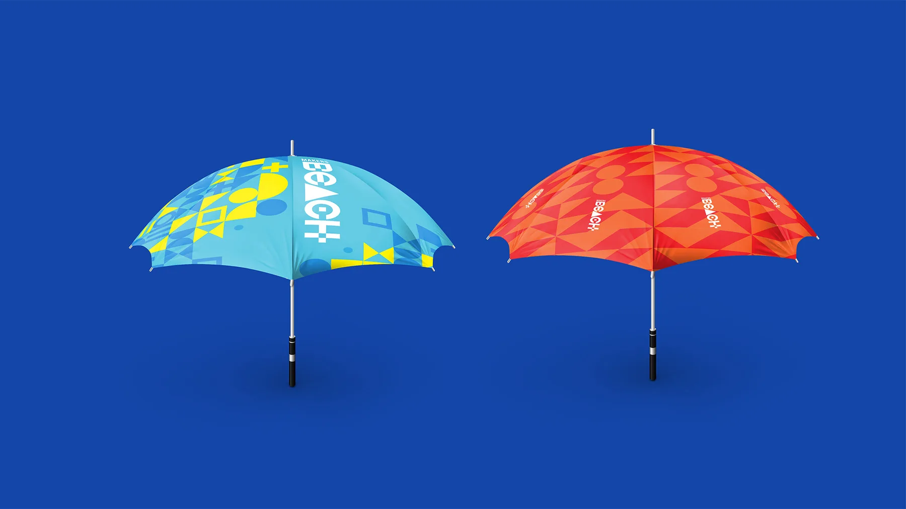
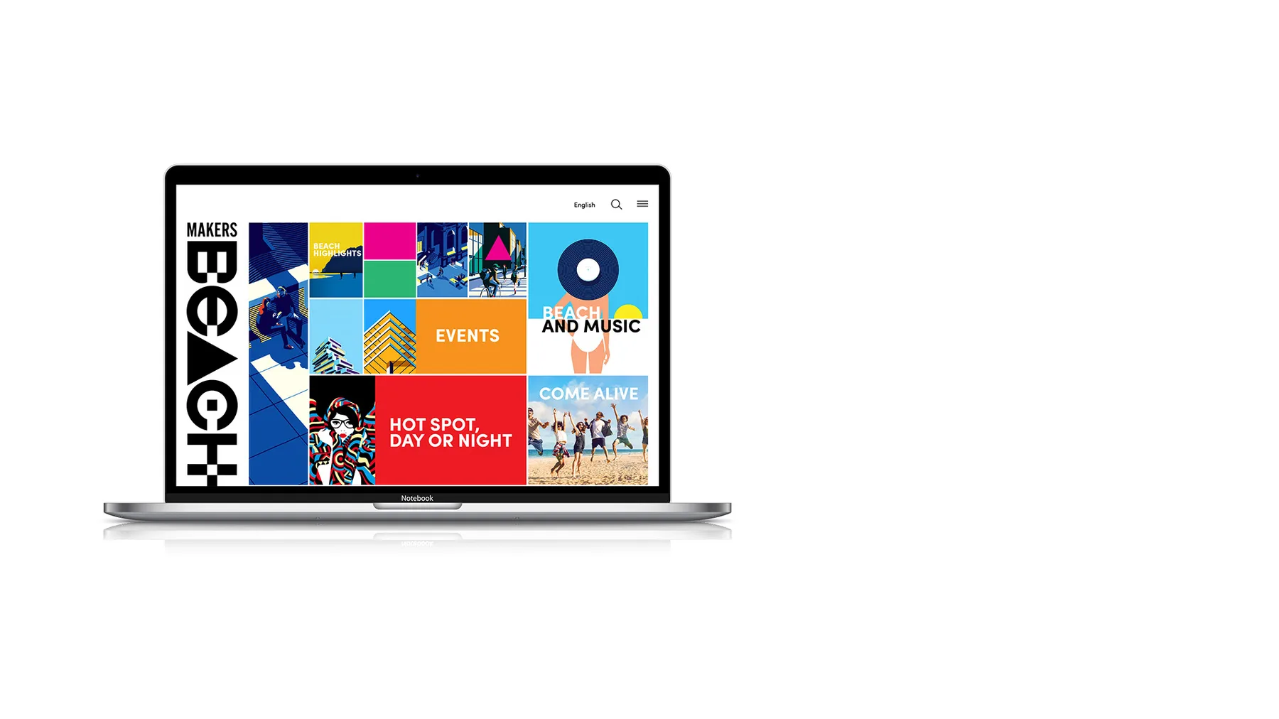
The wordmark is built entirely from primitive shapes: a square-and-circle B, a circle O, a triangle A, a circle-in-square C, a cross-grid H, so the brand’s whole visual language could grow out of that same geometry: a tessellating triangle pattern as a flexible backdrop, and a retro flat-illustration style for beach scenes instead of photography. One tagline device, “___ Come Alive.”, then lets the message flex by moment (friendships, morning runs, weekends, yoga, a DJ set) while the shapes and the line stay unmistakably one brand from a billboard down to a flip-flop.
The system
- Shape-Built Logotype
- Colour Lockup System
- Triangle Pattern Motif
- Illustration Language
- Tagline Device
Design development
“Friendships come alive.”
“Morning runs come alive.”
“Weekends come alive.”
“Asanas come alive.”
“Beats come alive.”
Come alive.
Execution
Impact
- 01One shape-built wordmark and pattern system, flexed across a full launch (OOH, on-site flags, merch and a printed community tabloid) without ever reaching for stock beach photography.
When the logotype is literally built from the same shapes as the pattern system, the brand doesn’t need extra rules to stay consistent: the geometry does that work on its own.