Lokesh Mohan
Event Design SystemAccel

Accel Connect

One wordmark, forty years, every touchpoint.

A design system for Accel Connect, Accel’s flagship community event marking 40 years of the firm, built to hold together across stage, street and screen.
Category
Design System, Event Identity and Environments
Client
Accel
Focus
Event design system & environments
Expression
Identity, Key visual, OOH, Merch and Digital
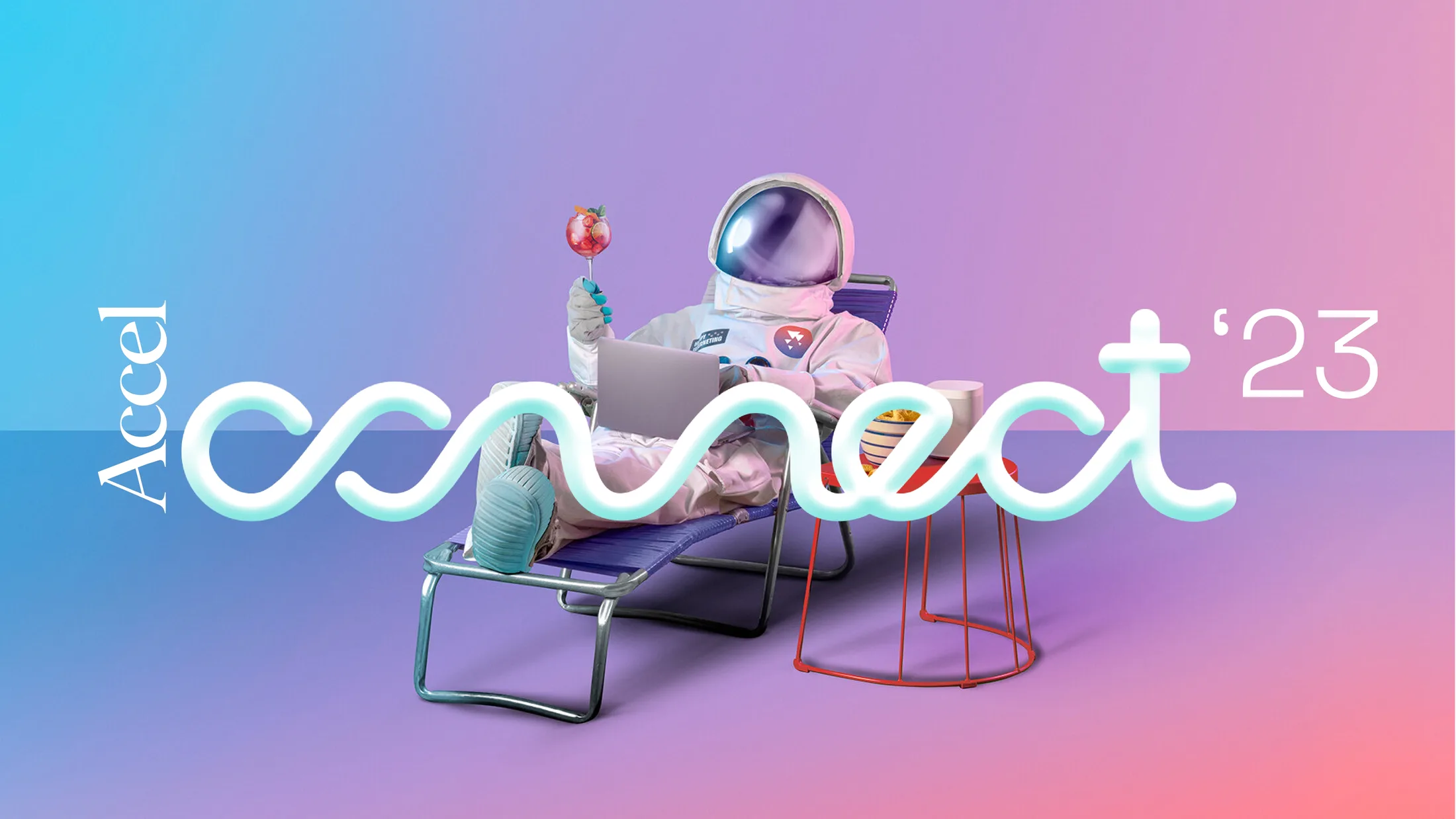
Accel Connect key visual: a retro-futurist astronaut lounging with a laptop, beside the Accel wordmark and the looping ‘connect’ logotype on a blue-to-pink gradient
01

Overview

Accel Connect is the firm’s flagship gathering for its community of founders, and this edition marked 40 years since Accel was founded. The event needed a system that could read as both a milestone and an invitation to what’s next.

02

Challenge

Build a design system flexible enough to run across a full event footprint (stage backdrops, OOH, delegate merch, apparel and the event microsite) while staying unmistakably one identity wherever it landed.

What I did

  1. 01Identity & logotype system
  2. 02Key visual direction
  3. 03Colour system
  4. 04Environmental design (stage, OOH)
  5. 05Merch & apparel application
  6. 06Digital application
03

Approach

The wordmark carries a single looping wave, a signal, a connection, running through the word “connect” itself. That wave becomes the system’s one recurring device, shown in a rotating colour system (from a single vivid gradient to flat brand colour) so it can flex from a 3-metre stage screen down to an embroidered chest logo without ever losing its identity. A retro-futurist key visual, equal parts nostalgia and looking-ahead, sets the tone: relaxed, confident, unmistakably about tomorrow.

The system

  • Wordmark & Wave Device
  • Colour Lockup System
  • Key Visual Language
  • OOH Templates
  • Merch & Apparel Guidelines
04

Design development

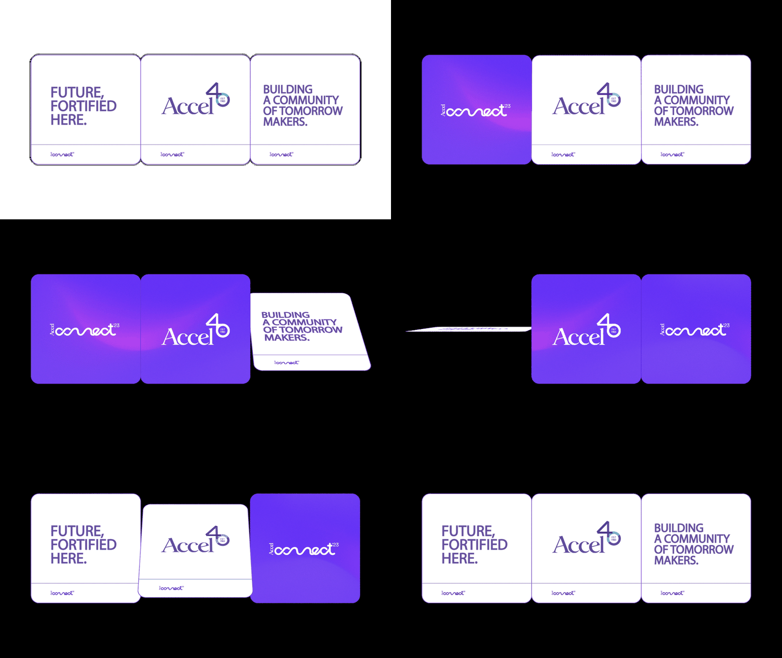
Animated Accel Connect message cards cycling through ‘Future, fortified here’, the Accel 40th-anniversary mark, and ‘Building a community of tomorrow makers’
01Key visual: modular message cards, in motion
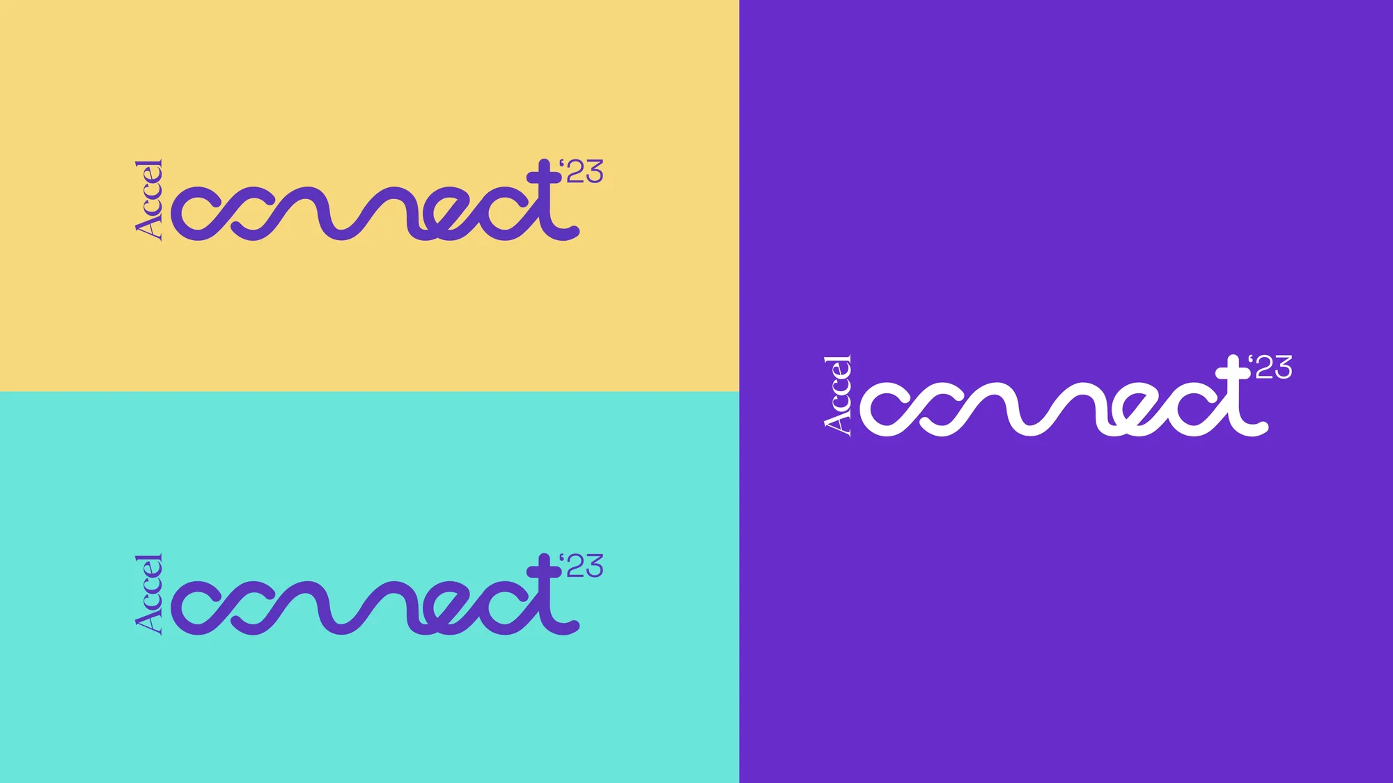
Accel Connect logotype shown in four colour lockups: purple on yellow, purple on mint, white on purple, and purple on white
01Logotype: one wave device, four colour lockups
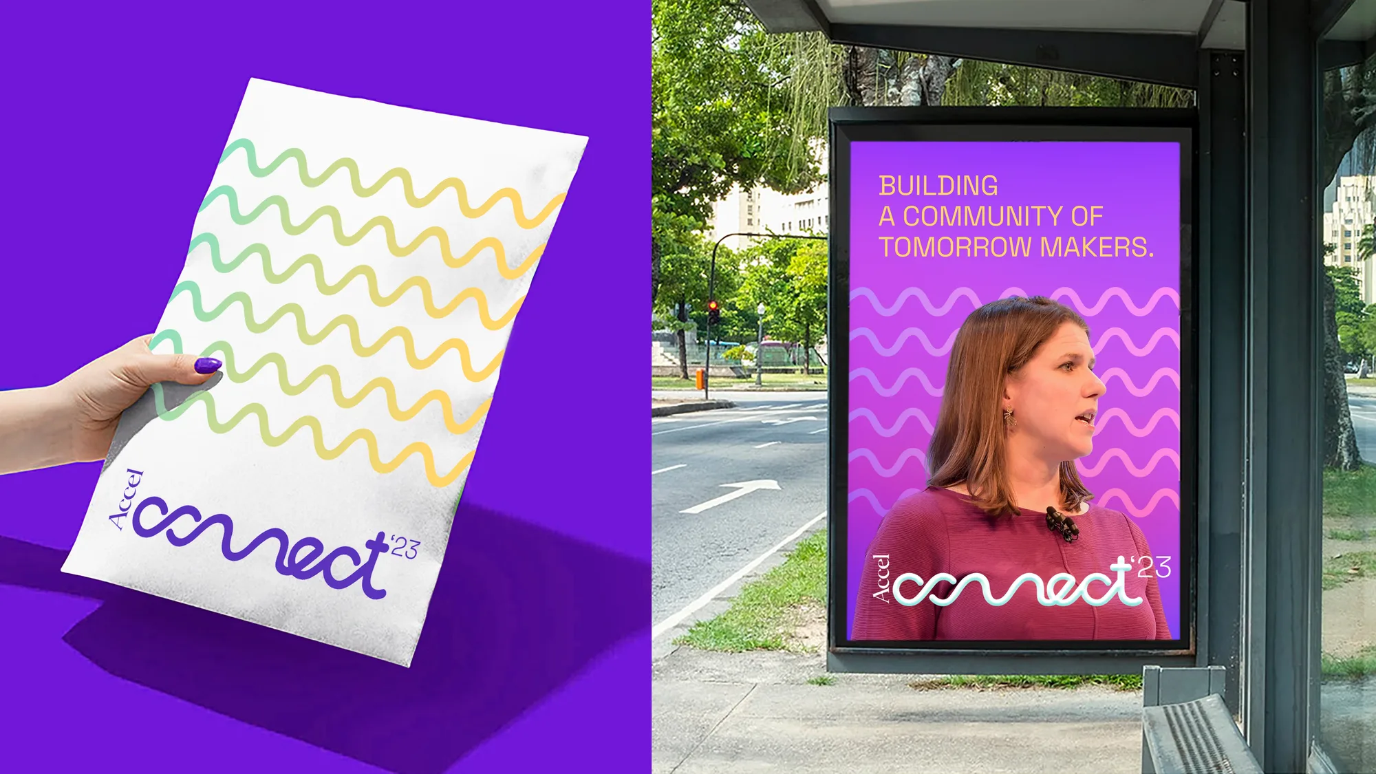
A hand holding a wave-pattern print poster beside a bus-shelter ad quoting ‘Building a community of tomorrow makers’
02Wave motif: print poster and transit application

It’s been 40 long years,

but we’ve only just begun.

In this incessant journey towards

pioneering, inspiring and exploring,

every day, to us, is day one.

First partner to future.

05

Execution

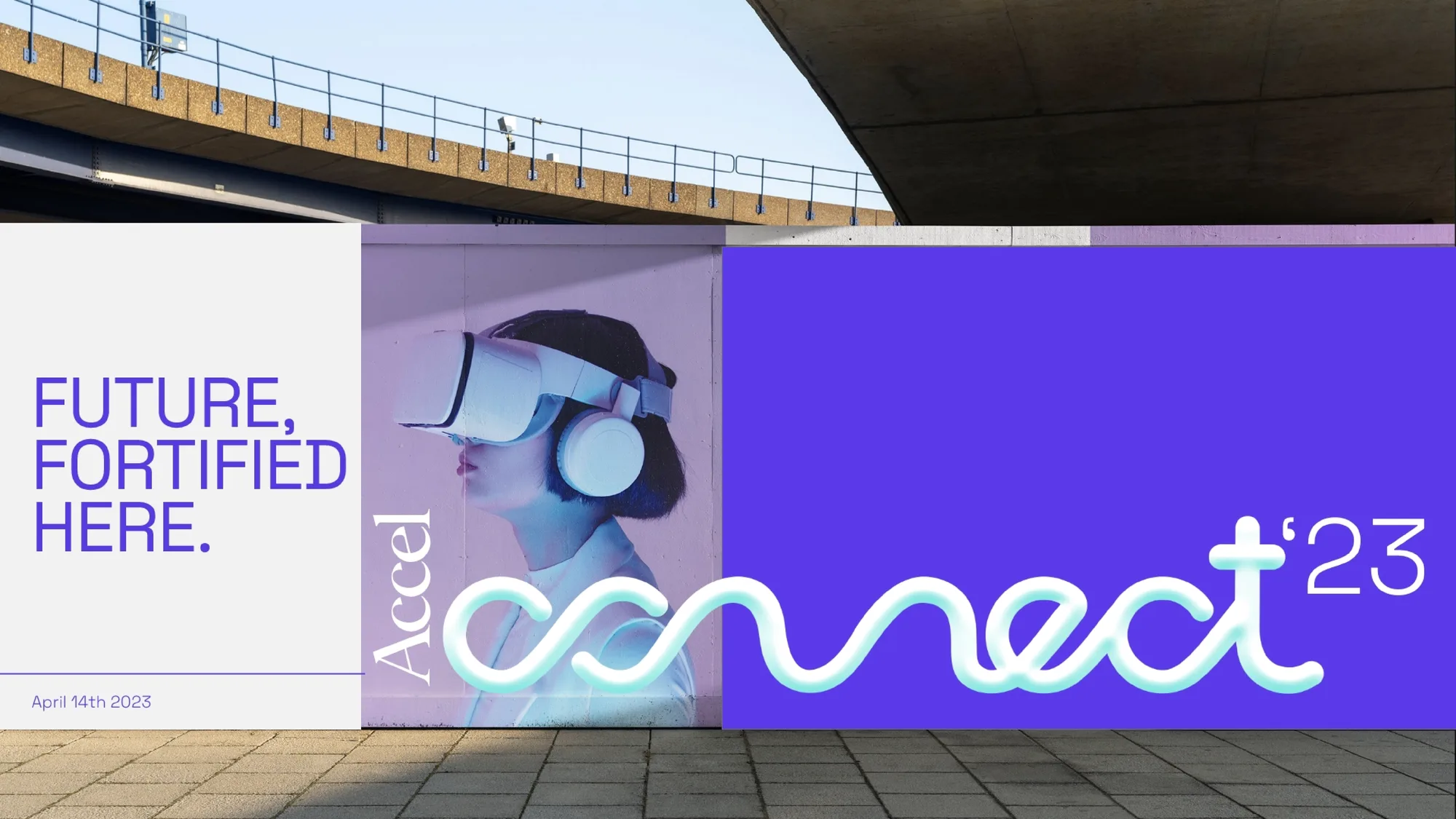
Accel Connect wall banner reading ‘Future, fortified here’ beside a VR-headset ad, installed under a highway overpass
01Wall banner: “Future, fortified here.”
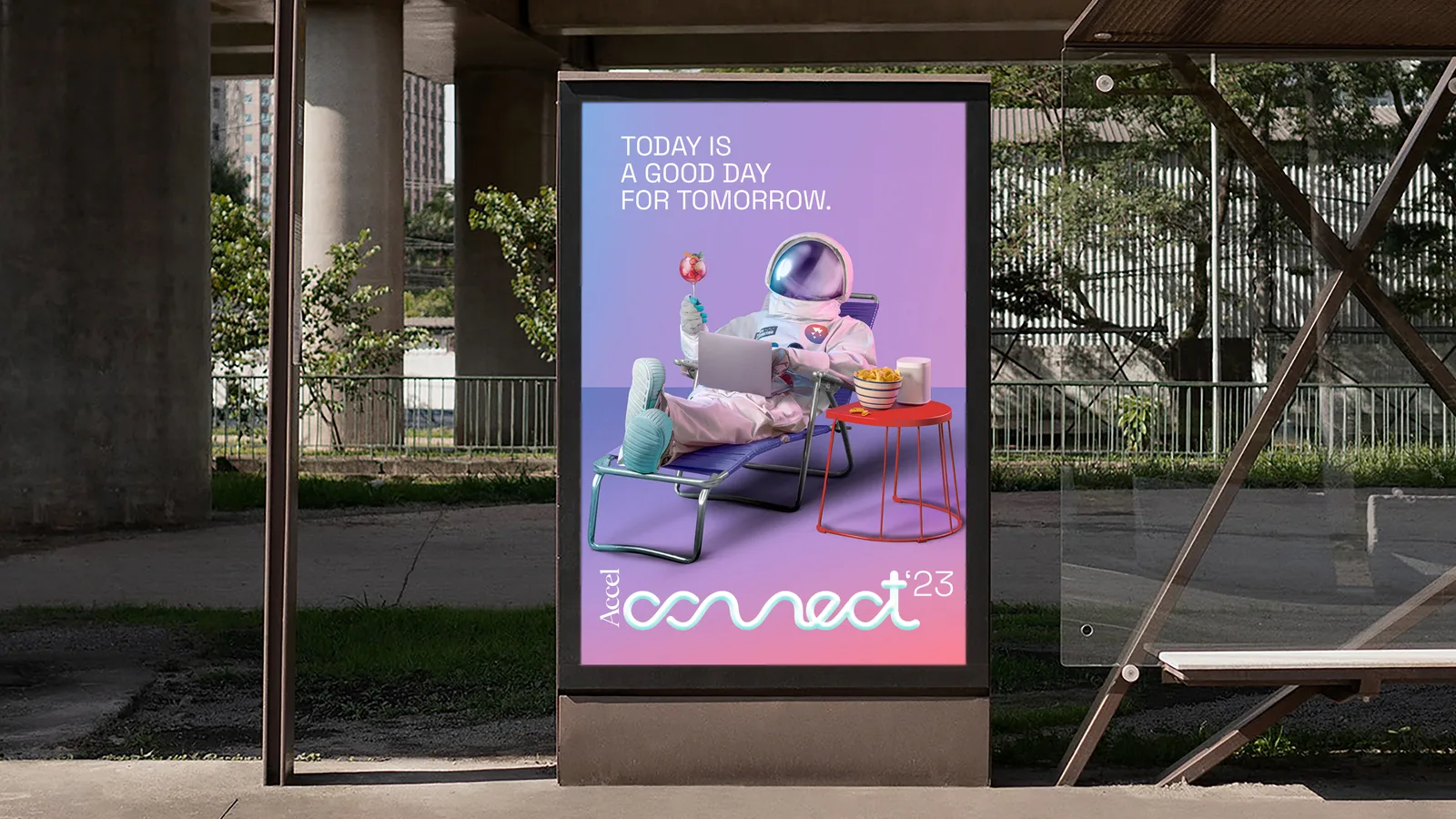
Accel Connect bus-shelter poster reading ‘Today is a good day for tomorrow’ with the astronaut key visual
02Bus shelter: “Today is a good day for tomorrow.”
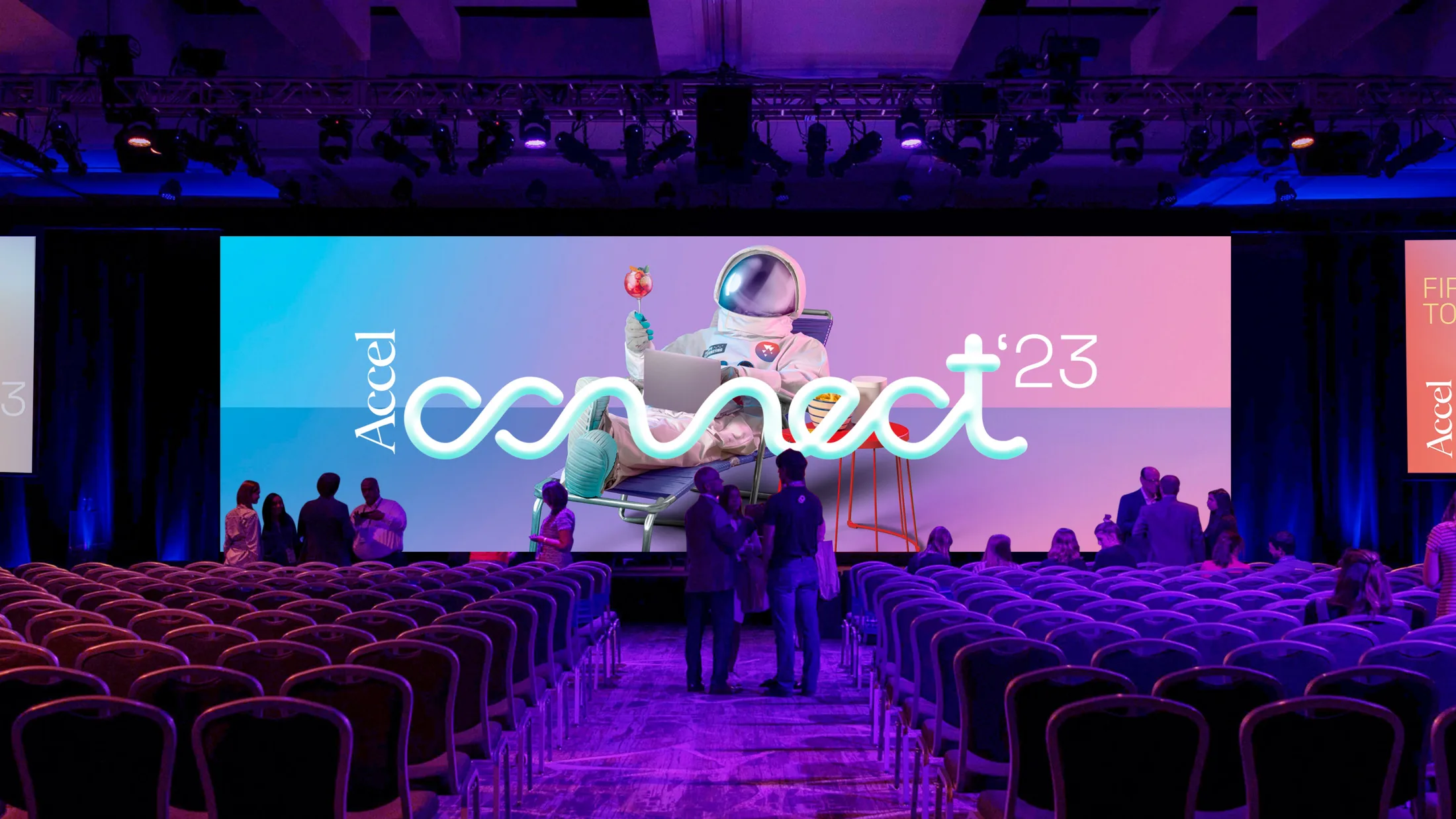
Accel Connect main-hall stage, a wide LED screen showing the key visual above rows of delegate seating
03Main-hall stage
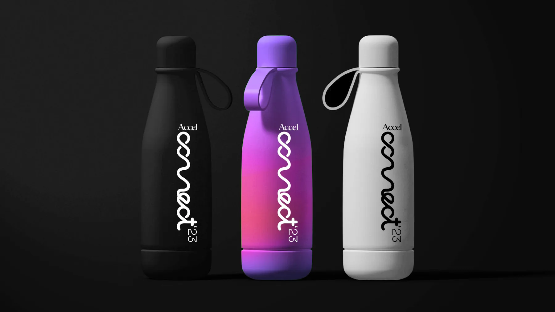
Three Accel Connect branded water bottles in black, purple-gradient and white
01Delegate water bottles
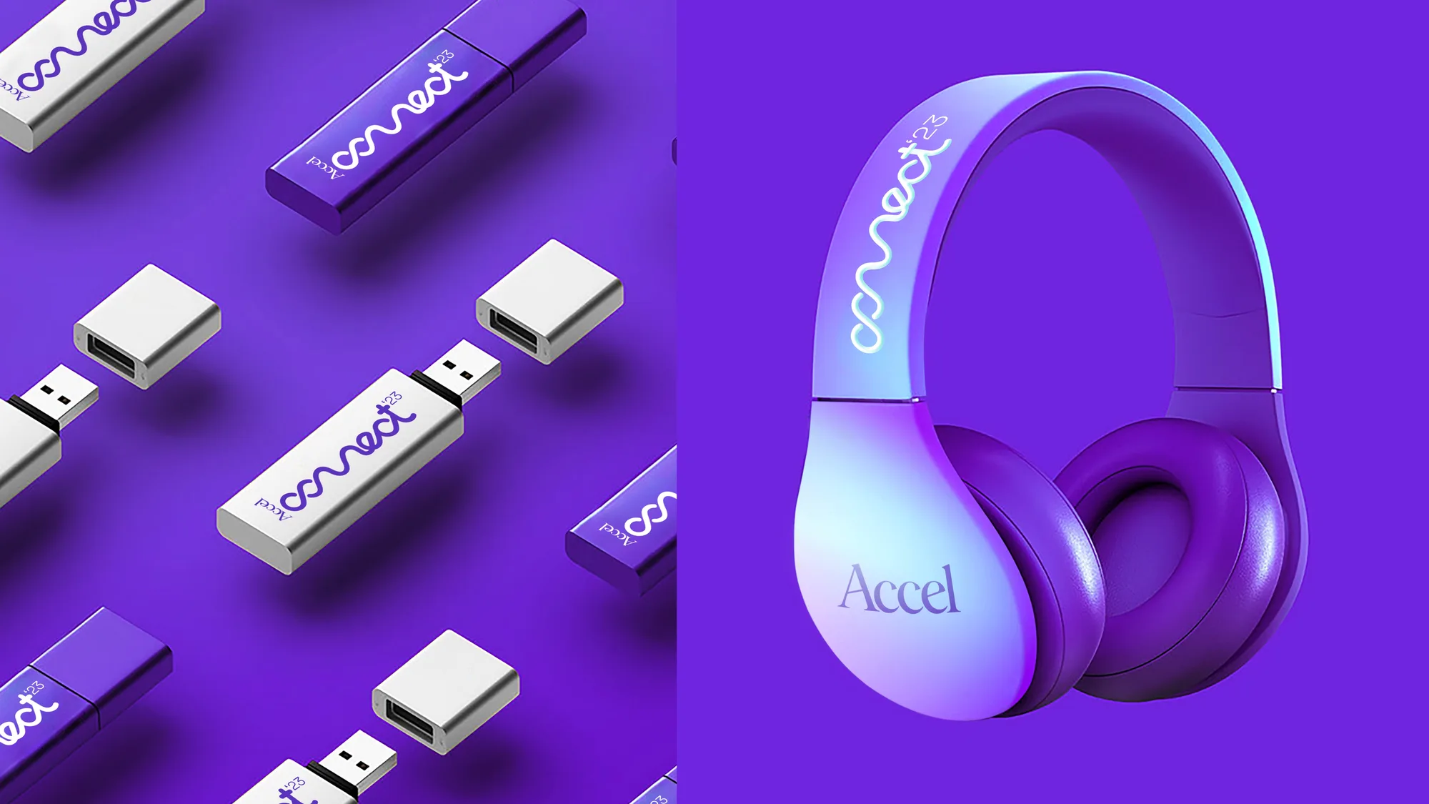
Accel Connect branded USB drives and wireless headphones with the wave logotype
02USB drives & headphones
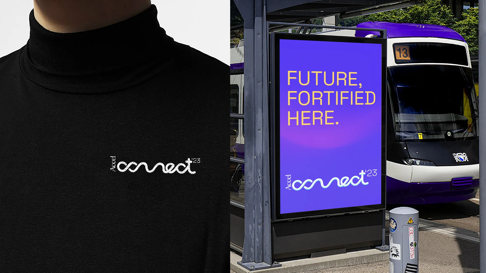
Accel Connect logo embroidered on a black turtleneck, beside a tram-shelter ad reading ‘Future, fortified here’
03Embroidered apparel & tram shelter
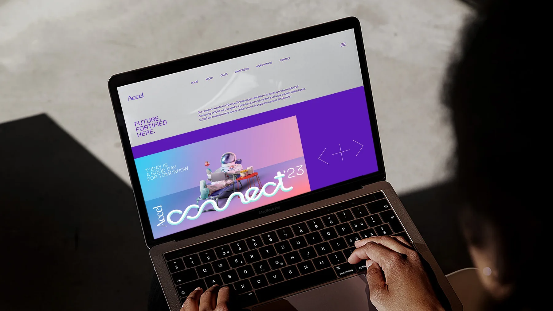
A laptop screen showing the Accel Connect event microsite carrying the same key visual and wordmark
04Delegate microsite
06

Impact

  1. 01One wordmark and one wave device, carried consistently across a full event footprint (stage, OOH, merch, apparel and digital) for a 40th-anniversary milestone.
Milestone
Marking 40 years since Accel was founded
Touchpoints
Stage, OOH (billboard, bus shelter, transit), merch, apparel, microsite
A milestone year needs a system, not just a moment: something that still feels like one brand whether it’s on a stage screen or a delegate’s water bottle.
Next project →Motiva WellnessBrand Identity & Packaging · Medical Wellness Association
Motiva wordmark sitting on a hand-drawn orange wave: the brand’s signature identity mark